- make it stand out
- make it easier for users navigate to the things they're looking for
- make it easier to update
Unfortunately they've swayed away from this in their new website, opting for a realtime feed like C+PB's feed crazy site.
Next there was Grey Stockholm. They decided to move their whole site to Facebook. By utilising the features that a Facebook Fan Page has to offer, they've created a sweet little site that is so easy to update.
The tabs contain everything you need. Here you can see their clients.
And here you can view their work. Just a simple piece of coding can mean you can update these pages so quickly.And, my favourite page for usability is the contact page. So simple yet perfectly in tune with the nature of Facebook.
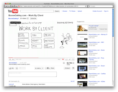
But, if you thought that was nice, you should check out Boone Oakley's site. Built completely inside YouTube, it appeared when YouTube started playing around with embed links inside their videos. By clicking on different areas of the video, you can navigate around.
And now, there's a new kid on the block. Namely Kamchtka, an Argentinean agency who have built their site all in Twitter. A brave way to do things, but with the new Twitter layout, I guess this now makes a lot more sense. No longer do you have to navigate away from the site to see content. And it makes it accessible to nearly all people.
This video shows how it works.


